This is a quick update chronicling my journey with fonts in MonoGame. Like the XNA Framework before it, it comes with decently robust support for creating sprite fonts from .ttf files as part of its content pipeline. You can then use those fonts to render text to the display very easily.
However, also like XNA, it’s notorious for making those fonts look like absolute garbage - especially at lower resolutions.
The Problem with Stock SpriteFont
MonoGame’s SpriteFont has serious limitations. It makes several assumptions about how the font should be rasterized, and most of them can’t be disabled in the font’s definition file. It applies some pretty fuzzy anti-aliasing, and the smaller you try to render the font, the worse the effect gets. Take a look at this example:

I put this together using Roboto Medium at 12pt, rendered onto a 480x270 internal surface. (The actual display has been scaled up to 960x540.)
You’ll notice that it looks… wrong. Obviously it’s a competently rasterized font, but it almost looks like you’re reading it through a magnifying glass, or like it’s been scaled up using a non-integer method. Alas, no - that’s just how fonts look in MonoGame.
The sprite font configuration (an XML manifest in a .spritefont file) is very straightforward:
<?xml version="1.0" encoding="utf-8"?>
<XnaContent xmlns:Graphics="Microsoft.Xna.Framework.Content.Pipeline.Graphics">
<Asset Type="Graphics:FontDescription">
<FontName>Roboto-Medium.ttf</FontName>
<Size>12</Size>
<Spacing>0</Spacing>
<UseKerning>true</UseKerning>
<Style>Regular</Style>
<CharacterRegions>
<CharacterRegion>
<Start> </Start>
<End>~</End>
</CharacterRegion>
</CharacterRegions>
</Asset>
</XnaContent>
If you’re looking for additional properties to configure the font’s rasterization further… too bad. There aren’t any.
Now, if you’re rendering at higher resolutions, like 720p and up, the blurry effect is far less noticeable. In fact, smoothing might even be desirable at those scales; 12pt font isn’t actually very big on a 720p display. However, what if you don’t want any smoothing at all? What if you’re making a retro game where the chunky pixels are a feature?
Introducing Bitmap Fonts
I am, of course, not the first person to make this observation about MonoGame. Being a relatively well-loved and proven framework, tons of developers have identified common faults in MonoGame and its abandoned predecessor, and they’ve sought to correct them. One such improvement is the MonoGame.Extended library. It brings implementations for several common idioms, but most relevant to this discussion, it provides support and extensions for bitmap fonts.
So what is a BitmapFont as compared to a SpriteFont? Well, in both cases the font gets rasterized to a texture by a tool ahead of time. Then, to draw a string at runtime, portions of that texture are rendered to the screen, glyph by glyph, by the framework. It knows all the texture coordinates, character spacings, kerning pairs and so on. The most pertinent difference is that you have full control over how the texture gets produced for a BitmapFont, and the framework doesn’t do anything to the glyphs aside from render them to the display directly.
Sounds great! You just need to produce a font texture using some kind of tool and write nice, chunky text pixels to the screen… right?
Most Fonts Are Not Pixel Fonts
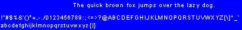
Yeah, about that. It turns out that the overwhelming majority of fonts are absolutely not meant to be rendered at low resolutions, and even then definitely not without some kind of smoothing. The documentation for MonoGame.Extended recommends an ancient tool called BMFont for rasterizing your font. In BMFont, you’re asked to provide the size of your font in pixels. I don’t know as much about computer font rendering as I should, but I do know that font “points” are not the same as pixels. Still, if you’re anything like me, you’ll experiment with a few different pixel sizes on your desired fonts. If you’re targeting low resolutions with a chunky pixel aesthetic, you might want your font to be somewhere between 8 and 12 pixels tall. Here’s what Arial looks like at 12px in BMFont’s preview:
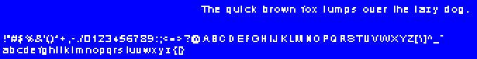
And here’s what it looks like in-game:
At first glance, it’s not bad! It’s appropriately chunky and the fuzzy anti-aliasing is completely absent. Unfortunately, it falls apart when you start looking at the details. For example, look at the 0 (zero). It looks like a D. Note the strange spacing on the lowercase z and uppercase X. See how the * (asterisk) is garbled and missing the top prong? How the - (minus) character is too short? None of these flaws are acceptable for a “production” font. The smaller you go, the more garbled the font gets.
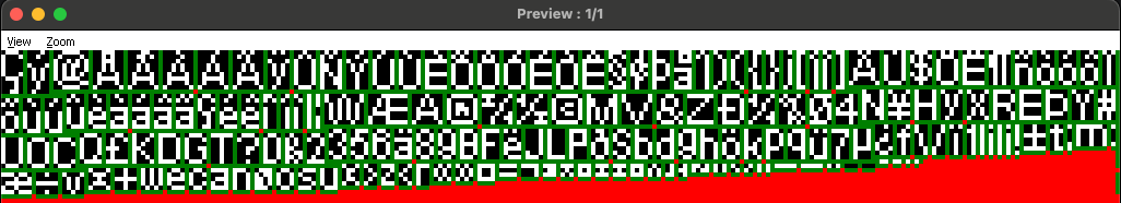
In fact, it turns out that going below 12px with almost every font I’ve tried produces completely illegible garbage. Here’s Arial again at 8px:
That’s not a squished image (I mean, probably not - I don’t know how you’re reading this). It’s just mangled. Unfortunately, it seems most fonts won’t work straight out of the box, even with BitmapFont.
Putting in the Work
Remember how I said that with a BitmapFont, you have full control over how the texture gets produced? For better or worse, it’s true. From here, you basically have two options to make a polished pixel font:
Modify the BMFont Output
If you followed the instructions in the MonoGame.Extended docs, BMFont produces two files. The first is a .fnt file whose format you specified in the Export Options. The second is a texture whose format was also specified there. MGE wants you to output the .fnt file as binary and the texture as .png. However, if you instead output the .fnt as XML, the MGE content pipeline extension can still parse it but you can also edit the output after it’s produced.
Combined with your ability to edit the .png file in an external editor, you can hand-correct the mistakes made by the BMFont rasterizer. It won’t be fun, though. BMFont packs the texture pretty tightly and out of order, and the .fnt file is dense and precise. Any changes you make will need to be painstakingly accounted for in the texture coordinates and offsets it produced for you. You can give yourself some space to work within by adding spacing between the characters in BMFont (in the Export Options), but you’ll still need to be meticulous about it.
Or…
Design Your Own Font
When you read through the XML .fnt file, you’ll realize that although the spec is dense, it’s not complicated. Here’s an excerpt from our Arial 12px font produced by BMFont earlier:
<?xml version="1.0"?>
<font>
  <info face="Arial" size="12" bold="0" italic="0" charset="" unicode="1" stretchH="100" smooth="0" aa="1" padding="0,0,0,0" spacing="1,1" outline="0"/>
  <common lineHeight="12" base="9" scaleW="256" scaleH="256" pages="1" packed="0" alphaChnl="4" redChnl="0" greenChnl="0" blueChnl="0"/>
  <pages>
    <page id="0" file="arial_12_0.png" />
  </pages>
  <chars count="191">
    <char id="32" x="197" y="26" width="3" height="1" xoffset="-1" yoffset="11" xadvance="3" page="0" chnl="15" />
    <char id="33" x="232" y="17" width="1" height="7" xoffset="1" yoffset="2" xadvance="3" page="0" chnl="15" />
    <char id="34" x="163" y="26" width="3" height="2" xoffset="0" yoffset="2" xadvance="3" page="0" chnl="15" />
    <char id="35" x="251" y="9" width="4" height="7" xoffset="0" yoffset="2" xadvance="5" page="0" chnl="15" />
    <!-- ... -->
  </chars>
  <kernings count="59">
    <kerning first="32" second="65" amount="-1" />
    <kerning first="121" second="46" amount="-1" />
    <!-- ... -->
  </kernings>
</font>
The <info> element contains metadata about the font. <common> has information about the font as a whole - lineHeight is how many pixels tall the font is, base is where the base line of the font falls within that line height, scaleW and scaleH are the size of the output texture, and so on.
The character definitions are even more straightforward.
- The
idrefers to the character’s integer Unicode representation (e.g.32is space,33is!,34is", etc.) and thex/ycoordinates are texture coordinates for this glyph. - Combined with the
widthandheight, this defines a rectangle for the glyph that will be used to render it to the display from the texture. - I’m not entirely sure how the
xoffsetandyoffsetwork - presumably it offsets the character on the display by the given amounts when rendering - but you can configure BMFont to rasterize the font such that the offsets are always zero anyway. xadvancedefines how many pixels to advance forward after rendering this character.pagerefers to which texture (defined in the<pages>section) this character comes from.- This is only important if you select a ton of characters for your font. Otherwise it’ll be 0.
chnlhas something to do with the RGBA layout of the characters as defined in BMFont (alongside thealphaChnl,redChnl,greenChnl, andblueChnlsettings in the<common>element).- I didn’t bother to fully wrap my head around this, I just followed what BMFont did based on the presets I selected. You can apparently mask multiple characters into a texture by layering them in the RGB channels, but this was never pertinent for my use case.
With this knowledge in mind, it’s not complex to build your own font following this spec. You may not be able to pack the texture as optimally as BMFont (although you could always lean on a tool like TexturePacker to do it for you, if you need to optimize it), and you’ll definitely want to write a script or a tool to produce the XML .fnt file, but it’s pretty straightforward. You’re more-or-less just defining the texture regions for each glyph in your texture.
Drawing your own font isn’t as hard as you might imagine, depending on how complex you need it to be. You basically just need to draw characters in a grid onto a PNG file. A tool like Aseprite will make it quite simple, especially if you’re creating a monospaced font. Variable width fonts are more difficult, of course, and if you try to get the kerning right too, you’ll spend quite a lot of time tweaking it.
Now, if you’re making a text-heavy game, the font is one of the most important visual elements of your game. It’s worth putting the time in to get it right. If not, you can probably get away without kerning and with minimal tweaking. Either way, once you’ve got your font prototyped, it’s worth setting up a script to produce the XML automatically. You should absolutely test the font in a real scenario - rendered by the BitmapFont extensions in MGE - frequently to make sure your texture coordinates, offsets, and other settings are working properly.
Tricks and Workarounds
Personally, I have already drawn a few pixel fonts in PICO-8 and Picotron and I found that workflow to be better than drawing them in Aseprite. These low-resolution environments are perfect for building and testing a small pixel font since you can iterate and test basically instantly. As a proof-of-concept, I wrote a cart in Picotron to export fonts in BMFont format:
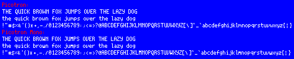
As far as I can tell, this is a pixel-perfect recreation of Picotron’s variable-width and mono fonts. If you want to see it in action, you can run load -u #picotron_bmfont_exporter. It exports the texture to the /desktop folder alongside the XML .fnt spec. (If you use this tool, make sure to remove the pod annotation from the top of the XML document when you take it outside of the fantasy environment.)
Going into detail on how to build fonts in Picotron or PICO-8 is outside the scope of this article, but thankfully it’s a well-documented and supported process (load #font_snippet in PICO-8 will get you started).
Alternatively, you can also find fonts which are designed to be rendered very small. This is obviously the path of least resistance. Several pixel font packs on itch.io, for example, come pre-rasterized and with XML specs already written.
Fonts are Hard
Turns out it’s not easy to get a pretty, well-formed pixel font appropriate for low resolutions. It takes some work, especially if you’re trying to go smaller than 12px. I imagine this explains some of the reasoning behind the trade-offs inherent to the stock SpriteFont: they might not be pretty, but they’re legible and very easy to create.
Thankfully, the tools are out there to make your perfect chunky pixel font look great. I hope this little journal helped you learn something new about fonts in MonoGame - it certainly took a bit of discovery for me to get the results I was looking for.
If you’re interested in picking up this adventure where I left off, one piece of software I never looked into was Font Forge. Supposedly, it gives you full control over the design and implementation of true-type fonts, so perhaps the most “complete” solution would be to build your font from the ground up as one which scales to any size. That way, if you need multiple font sizes in your game, you’re not stuck having to scale or re-draw your original font.